
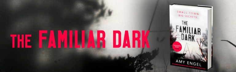
Behind the Scenes: Designing the cover of The Familiar Dark
Lewis Csizmazia, Senior Designer at Hodder & Stoughton, takes us behind the scenes of the cover design process for Amy Engel’s new nail-biting thriller, The Familiar Dark.
I’m a senior book cover designer predominately working across the vast crime and thriller list at Hodder & Stoughton. I wanted to take you through the cover design processes of a very exciting book I’ve worked on recently.
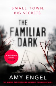
At our weekly cover meeting, Senior Commissioning Editor Eve Hall briefed an exciting new thriller. It was set in a small atmospheric town in the Missouri Ozarks and titled The Familiar Dark by bestselling author Amy Engel.
‘Can we do something with the text or image that is unexpected’ I found Eve’s brief refreshing and knew we could work together on something a bit different from the norm. I wanted to capture the mood and feel of a thriller, but design something different for a genre that can, at times, feel very familiar.
Coincidentally, a week before the briefing of The Familiar Dark I had come across a short video of Walt Disney’s MulitPlane Camera from the 1940’s. Here is a link to the video (skip ahead to 3 minutes 20 seconds, if you don’t want to watch the whole thing) Disney had found that if you layered backdrops on top of one another and moved each slide you then would bring more depth and reality to the once flat illustration.
With Walt Disney’s MultiPlane camera as my inspiration, I wanted to create a scene that felt like the viewer was in the Ozarks, as well as portray the uneasiness of the novel. So, I set myself the challenge of taking a step back from the computer (often the easiest route when designing) to try to be more creative; creating the scene by hand, like Walt Disney in the 40’s.
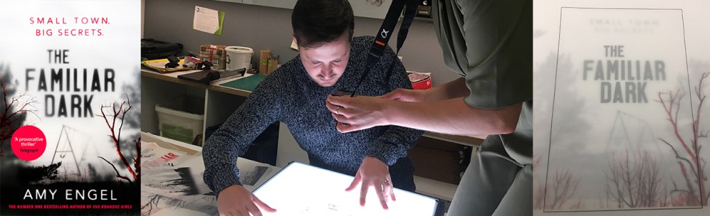
We have a brilliant print room in the Hachette office, and I knew that would be the first place to see what was possible. We looked at various sheets of transparent paper and printed lots of quick tests to see how images would look layered on top of one another. After many trips down to the print room and many colour tests we found that black and white images with a high contrast worked the best.
Working alongside the design team’s picture editor, Libby Earland, our next step was to work out the composition of the image. We made lots of test prints with various forests and branches in different sizes and layered them over a light box. We accidentally pinched the acetate whilst moving it around and found to our delight the image would instantly become misty and more atmospheric. Also, the more layers you had, the eerier and darker the image became.
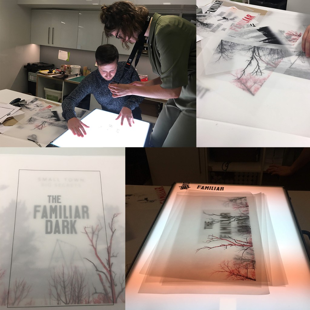
After finding the happy accidents with the branches and the swings, we thought perhaps the type could have the same effect. The unpredictability of this effect is something which could look so much more forced whilst doing digitally on Photoshop.
Once we had got the image and type right and all together, Eve and I brought the image to our weekly cover meeting where the editorial, design, marketing and sales teams critique the cover visuals. This is the make or break meeting for the cover as it is the final internal approval process. We presented the cover and it was unanimously approved. A major relief after all the weeks spent working on it!
As soon as the cover is approved by author and agent, Marketing then use the files for their advertising campaign. Looking after this title was Marketing Manager, Maddy Marshall who has been doing an amazing job planning various exciting events on the run up to the publication.
I thoroughly enjoyed working on The Familiar Dark. As you can see, there are many hands that helped throughout the process. I’m very excited to say that The Familiar Dark comes out on the 31st March and hopefully will make it into your hands then too!
Related Posts
Free Extract! Sister Dear by Hannah Mary McKinnon
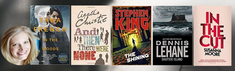
Five of my favourite mysteries and thrillers by Amy Engel
Read an extract of The Familiar Dark by Amy Engel
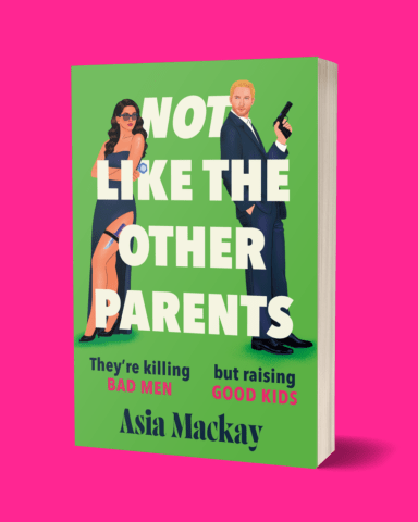
Read the first chapter of Not Like the Other Parents by Asia Mackay

Read an exclusive extract from A Degree of Murder by Maz Evans
